Azure DevOps dashboard widgets that bring sprint health to your homepage
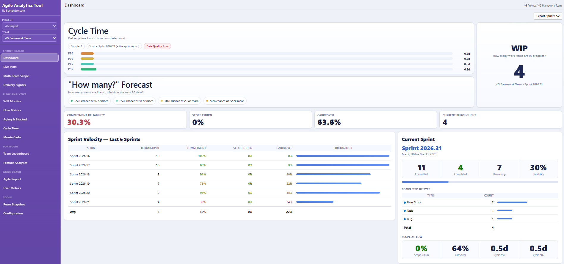
If your team already lives on the Azure DevOps dashboard page, you do not want analytics in a separate tool. Agile Analytics ships dashboard widgets that pin directly to any Azure DevOps dashboard — so sprint summary, velocity, burndown, and flow signals are visible the moment your team opens ADO.
Why buyers search for this
- Out-of-the-box ADO dashboard widgets cover work item queries but miss sprint health and flow analytics
- Teams build custom dashboards once and never refresh them because there is no reliable widget set
- Stakeholders want a single Azure DevOps dashboard view, not a separate analytics URL to remember
What this page should help them do
- Pin sprint summary, velocity, burndown, cycle time, and flow widgets to any Azure DevOps dashboard
- Keep your existing dashboard layout and add analytics widgets alongside your current charts
- Give every stakeholder a live snapshot the moment they land on the ADO dashboard page
Every Agile Analytics widget you can pin to an Azure DevOps dashboard
Each Agile Analytics widget is a self-contained tile that you add through the standard Azure DevOps dashboard "Add a widget" panel. Once pinned, every widget renders inside ADO using the same data you already have in Boards — there is no connector to configure, no exported dataset, and no separate analytics URL for your team to remember. Each tile below answers a different sprint or flow question, and teams typically pin three or four together to build a sprint-and-flow homepage that lives right next to their existing dashboards.
- Sprint Summary widget: current sprint goal, committed-vs-completed, scope changes, and burndown in one tile, so the daily standup has a single source of truth without leaving the dashboard page.
- Velocity widget: rolling velocity across the last 6–10 sprints with a configurable team filter, so leads can spot a slowdown before sprint planning instead of after the retrospective.
- Burndown with commitment line: a burndown chart that draws the original committed scope as a baseline, so late-added work shows up visually instead of being hidden under a redrawn ideal line.
- Cycle Time scatterplot widget: completed work item cycle times with P50/P85 percentile lines, so the team sees its real flow distribution and outliers without exporting to a separate analytics tool.
- Throughput widget: items finished per sprint or week, optionally broken down by work item type when you map them — a leading indicator that velocity-by-points often misses.
- Flow signals widget: aging work, blocked items, and WIP-over-limit conditions surfaced directly on the dashboard so managers see flow risk daily, not at the end of the sprint.
How widgets fit into a real Azure DevOps dashboard layout
Most teams already have a dashboard page in Azure DevOps with team-specific tiles, query results, and build status. The Agile Analytics widgets are designed to live alongside those existing tiles, not replace them. You keep your current layout and add the analytics views in the same panel where your team already starts each day. For organisations with multiple teams, every team can configure the same widget set independently — a Scrum team can pin Sprint Summary and Burndown with their own team filter, while a Kanban team next door pins Cycle Time and Flow Signals on a different dashboard. There is no global setting that forces one configuration across the organisation, so each team can build the dashboard that matches how it actually delivers.
What every Azure DevOps dashboard widget should show
The evergreen widget guide — sprint summary, velocity, burndown with commitment line, cycle time scatterplot, throughput, and flow signals.
Open page →Open the full Azure DevOps dashboard
When you want the unified delivery dashboard rather than individual widgets pinned to a custom layout.
Open page →Team Health, Cycle Time, Throughput widget release notes
Walkthrough of the three extension widgets shipped in v3.1.5 — how they compute and how to add them.
Open page →View pricing
Every widget is included on every plan from $25/mo — no add-ons or widget-tier upgrades.
Open page →Questions buyers usually ask next
Which dashboard widgets are included?
Sprint summary, velocity, burndown, cycle time scatterplot, throughput, and flow signal widgets — all configurable per team and pinnable to any Azure DevOps dashboard.
How do I add an Agile Analytics widget to an Azure DevOps dashboard?
Open the Azure DevOps dashboard you want to extend, click "Add a widget", and select any Agile Analytics widget from the gallery. Configure the team and date range from the widget settings panel — the widget then renders inside the dashboard alongside your existing tiles, with no separate setup step required.
Can each team configure the widgets independently?
Yes. Widget settings are stored per dashboard, so a Scrum team can pin Sprint Summary and Burndown with their own team filter while a Kanban team uses Cycle Time and Flow Signals on a different dashboard. There is no global setting that forces one configuration across the organisation.
Do the widgets work for every team in our organisation?
Yes. Every team in your Azure DevOps organisation can use the same widget set on their own dashboards under the org-level licence.
Do the widgets refresh automatically when work item state changes?
The widgets use Azure DevOps Analytics data, which updates as work items move through your boards. Each widget reflects the latest state when the dashboard is loaded or refreshed; there is no manual refresh job to schedule and no exported dataset that goes stale between syncs.
Do widgets need a separate trial?
No. Widgets are part of the same 30-day free trial as the rest of the extension. Install once and every dashboard widget is available immediately.
What happens to the widgets if our trial expires before we subscribe?
When the trial expires, each widget shows a notice and the team can keep the dashboard layout itself, but the analytics views stop rendering data until the org activates the subscription. Pinned widgets are preserved, so resuming after a paid plan starts is just a matter of activating the licence.