Use Case
Flow Metrics for Azure DevOps
Agile Analytics is an Azure DevOps extension that shows flow metrics, cycle time, aging WIP, and WIP limits for teams on Azure DevOps Services (cloud). Buyers evaluating an Azure DevOps flow metrics tool are usually past the built-in charts and looking for one place that ties flow efficiency, cumulative flow, aging work, and throughput together. Agile Analytics computes all four from the same Azure DevOps work item history, inside the hub, without a separate reporting pipeline.
Why flow metrics are hard to see in Azure DevOps
- Azure DevOps Boards shows work items and a few charts, but no single view ties flow efficiency, cumulative flow, aging, and throughput together
- Teams can sense delivery is slowing down without being able to say which stage is actually responsible
- Building the same picture by hand means a cycle time export here, a WIP count there, and a spreadsheet that drifts out of date within a sprint
What Azure DevOps flow metrics show you
- See flow efficiency, cumulative flow, aging work, and throughput in one Azure DevOps flow metrics tool, wired to your boards
- Know which workflow stage is responsible for the delay, not just that cycle time is longer than last sprint
- Catch aging and blocked work before it becomes a sprint surprise, using thresholds calibrated to your own history
What the Azure DevOps flow metrics tool measures
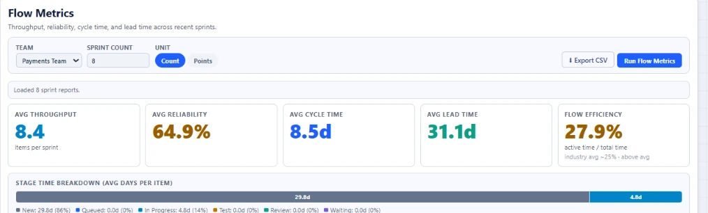
Flow Metrics is the Azure DevOps view built for one question: is delivery speeding up or slowing down, and where. It pulls throughput, cycle time, and WIP averages into a single sprint-over-sprint read, then breaks each sprint into a per-stage time split (New, Queued, In Progress, Test, Review) so the days are attributed to a stage instead of buried in one number. A Little’s Law panel compares the cycle time your WIP and throughput predict against the cycle time you actually delivered. When the two diverge, the gap is queue time the board itself never shows.
Flow efficiency: how much of cycle time in Azure DevOps is actual work
Flow efficiency divides the time an Azure DevOps work item was actively being worked (in progress, test, review) by its total cycle time (active time plus wait time), the definition Daniel Vacanti and Don Reinertsen use in their flow writing. Most Azure DevOps teams land in a 15 to 40 percent healthy band; the rest of cycle time is queueing, not effort. One honest caveat worth knowing before you trust the number: a reading at or above roughly 95 percent almost always means your workflow states were never mapped into wait stages, not that the process is genuinely near-perfect. Agile Analytics flags that case as suspicious instead of celebrating it.
Cumulative flow: seeing WIP and throughput drift on your Azure DevOps board
A Cumulative Flow Diagram is a stacked area chart that plots how many work items sit in each of six stages (New, Queued, In Progress, Test, Review, Done) on every day of a date range, built by replaying each item’s Azure DevOps state history rather than snapshotting today’s board. A healthy CFD looks like parallel bands moving steadily to the right. A widening In Progress band means WIP is accumulating faster than it is finishing; a flat Done band means throughput has dropped, usually from an upstream bottleneck. The chart respects your saved workflow mapping, so a custom state like "Code Review" still lands in the right stage.
Aging work items: catching stalled Azure DevOps items before standup
Aging tracks how many days an in-progress Azure DevOps work item has sat without reaching done, then checks that age against your own team’s cycle time history rather than an industry rule of thumb. An item older than your median cycle time deserves a look; one older than your 85th percentile is statistically at risk. The Aging view plots this on three zones (healthy, watch, stale) calibrated from your own p50 and p85, and separately flags items explicitly tagged blocked. Reviewing the oldest items first, instead of a round robin status update, is usually the fastest way to turn a standup into something that changes an outcome.
Throughput: forecasting Azure DevOps delivery from what your team actually finished
Throughput counts how many Azure DevOps work items your team actually finished each sprint or week, plotted as both a histogram and a sprint-by-sprint trend so a single strong or weak sprint does not read as a new normal. It is also the input that makes forecasting credible: Little’s Law ties cycle time to WIP divided by throughput, and Monte Carlo forecasting draws its delivery ranges from the same completed-item history. A team whose throughput swings widely sprint to sprint should expect wide forecast ranges too. The histogram and trend live in the same Flow Metrics view as flow efficiency, cumulative flow, and aging, so none of the four numbers has to be reconciled by hand.
Why a connected Azure DevOps flow metrics tool beats stitching four reports together
Most teams looking for an Azure DevOps flow metrics tool have already tried assembling the same picture by hand: a cycle time export here, a WIP count from the board, a throughput tally in a spreadsheet, and an aging list nobody remembers to refresh. Each one drifts out of date at a different rate, so the numbers stop agreeing with each other by the second week. Agile Analytics computes flow efficiency, cumulative flow, aging, and throughput from the same Azure DevOps work item history and the same saved workflow mapping, so the four views can never quietly disagree, and a state change on the board reaches the chart without anyone rebuilding a spreadsheet to keep up.
See WIP monitoring for Azure DevOps
Flow Metrics tells you when the numbers are drifting. WIP Monitor tells you which column is actually overloaded, with per-column limits and item age.
Open page →See cycle time analytics for Azure DevOps
Percentile-based cycle time and service expectations, the half of the flow picture Flow Metrics summarizes into a single sprint-over-sprint number.
Open page →Read the Cumulative Flow Diagram guide
How the six-stage stacked area chart is built from your Azure DevOps state history, and the patterns worth watching for as bands widen or flatten.
Open page →Read: using aging work items to run better standups
How to structure standup around the oldest in-progress items, using percentile thresholds instead of gut feel.
Open page →Azure DevOps analytics extension
The product behind this page: 30+ views inside Azure DevOps, read in your browser with no Power BI and no personal access token.
Open page →Azure DevOps flow metrics questions
What counts as a "flow metric" in Azure DevOps?
On this page: flow efficiency (active time versus total cycle time), cumulative flow (WIP by stage over time), aging (how long in-progress items have sat without finishing), and throughput (items completed per sprint or week). Cycle time and WIP each have their own dedicated view for a deeper look.
Why is my flow efficiency reading close to 100 percent?
That is almost never a genuinely perfect process. It usually means your workflow mapping has no states classified as wait or queue time, so every minute an item existed counts as active work. Map your queued and waiting states in Configuration and the number will drop to something you can trust.
Does flow metrics tracking work for Scrum teams, or only Kanban?
Both. Cumulative flow and aging are Kanban-native ideas, but Scrum teams get the same value: flow efficiency explains why a sprint burndown stalled, and throughput feeds the same forecasting a Kanban team relies on.
What is the best flow metrics tool for Azure DevOps if we do not want to export data to Power BI?
Agile Analytics reads flow efficiency, cumulative flow, aging, and throughput directly from your Azure DevOps work item history inside the hub. There is no separate BI workspace, no dataset to model, and no publisher-hosted analytics backend for these views.
How does flow metrics relate to WIP monitoring and cycle time analytics?
Flow Metrics is the summary view: throughput, cycle time, and WIP averages with a per-stage breakdown of where days go. WIP Monitor and Cycle Time Analytics are the drill-downs, each its own page, for when the summary tells you something is wrong and you need to see exactly where.
Are flow metrics only available on higher plans?
No. Every feature is on every plan, including flow metrics, cycle time, aging WIP, and WIP limits. The plans differ only in the number of seats.
Does Agile Analytics work with Azure DevOps Server?
No. Agile Analytics supports Azure DevOps Services (cloud) only, not Azure DevOps Server.
Which Azure DevOps permissions does Agile Analytics request?
It requests four read-only scopes: vso.project, vso.work, vso.graph, and vso.build. Your work-item content stays in your own Azure DevOps tenant.
Is there a free trial, and how much does it cost?
There is a 30-day free trial with no credit card. After that, annual plans are per organisation: Team is $300/year for 2 seats; Business is $1,200/year for 6 seats; Premium is $2,000/year for unlimited seats.